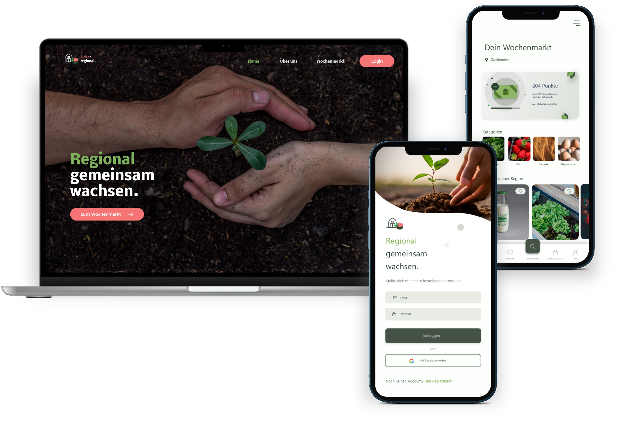
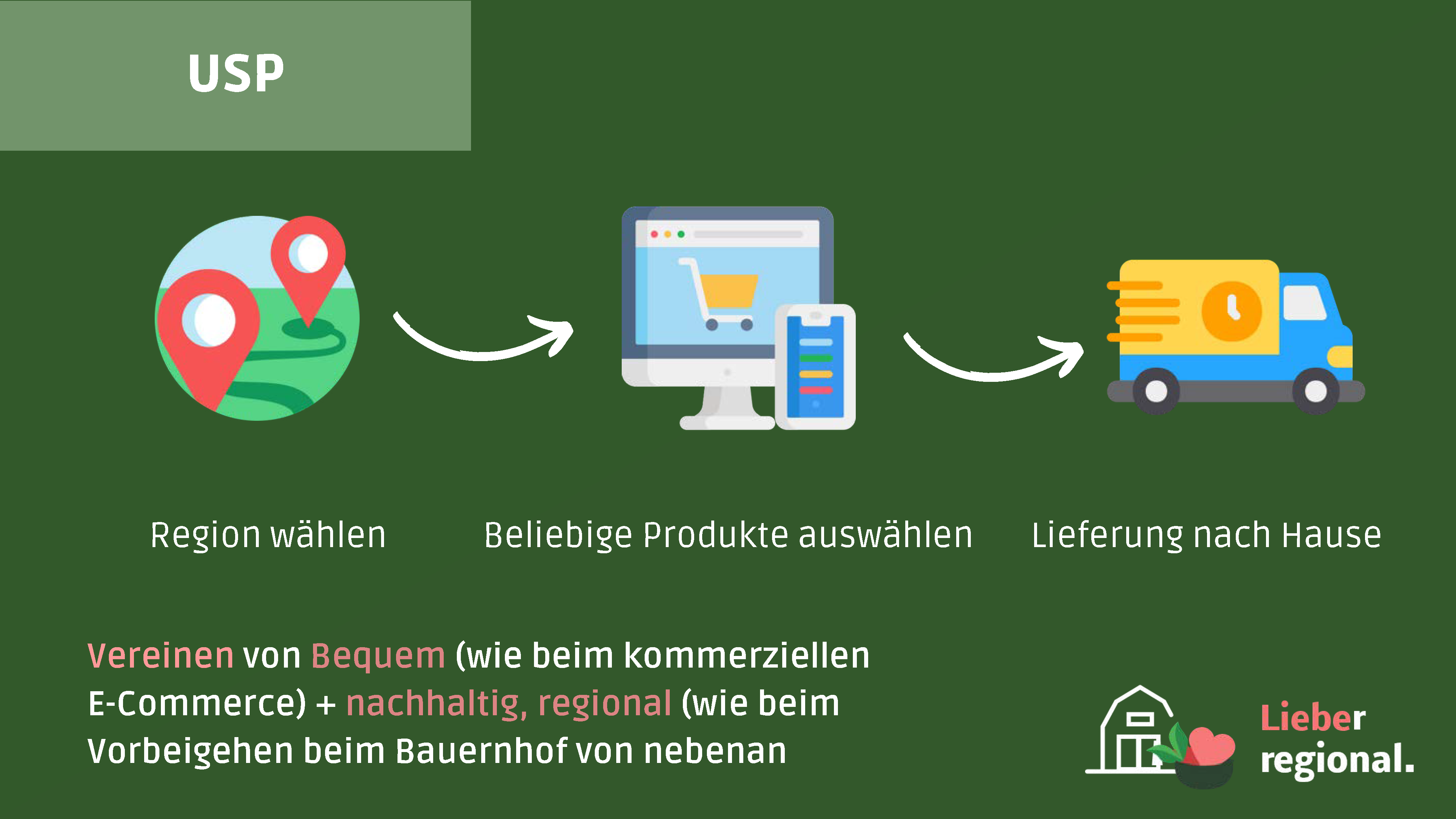
"Lieber regional" bridges the gap between local farmers and customers as a platform that farmers can showcase their fresh products on daily, while customers within a certain radius can purchase these products online. Buyers can either opt for home delivery or pick up the products directly from the farm.
"Lieber Regional" is the outcome of our concluding project in the "Cross Media Marketing" module, which I opted for as an elective during my studies. Our assignment was to develop a cross-media marketing image campaign aimed at enhancing awareness of local farmers and increasing their sales, with a strong emphasis on encouraging local purchases. The directive was to promote this idea through a digital weekly market and to generate content for a minimum of two distinct media channels, concluding with a campaign pitch as our final presentation.
As a team, we collaborated to develop the brand strategy and campaign concept, outlining the overall framework for our campaign content. While my teammates concentrated on detailed strategic planning, the design of printed materials, and essential project documentation, my focus centered on refining the app concept and ultimately creating the final designs for both the website and app. Given these clearly defined responsibilities, and given my specific charge of the digital representation for the Wochenmarkt, I'll primarily provide a more detailed account of its development here.
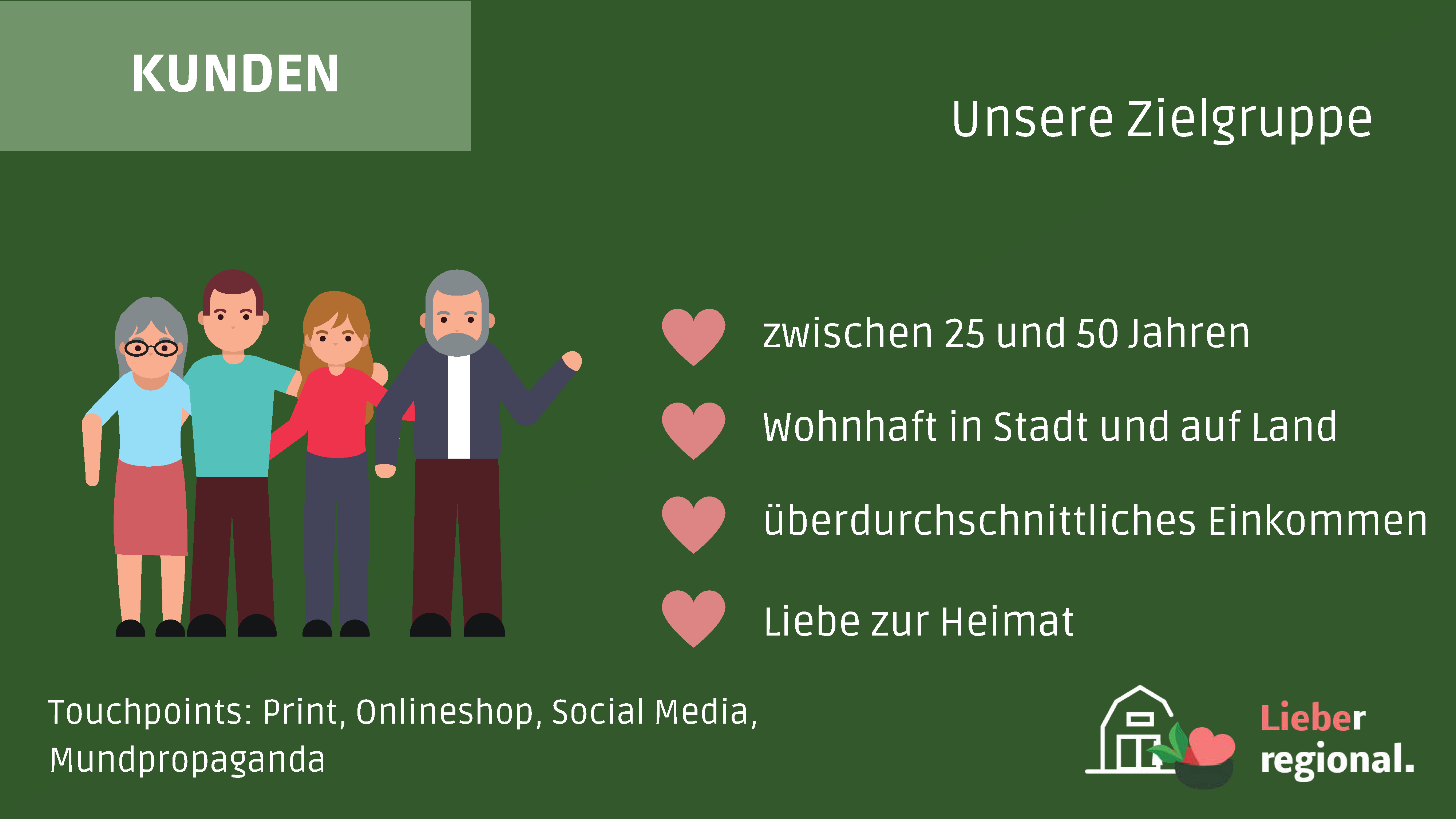
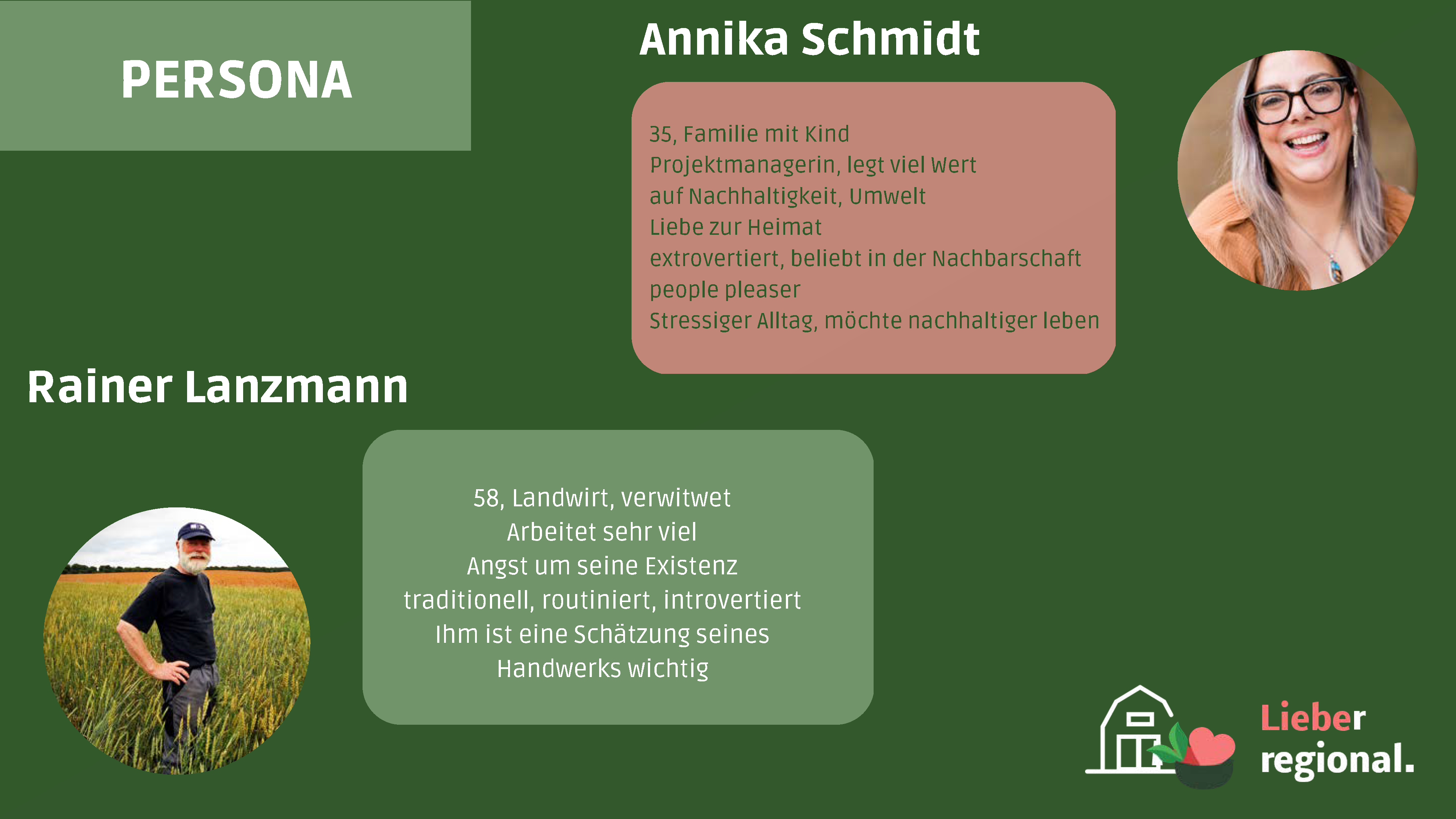
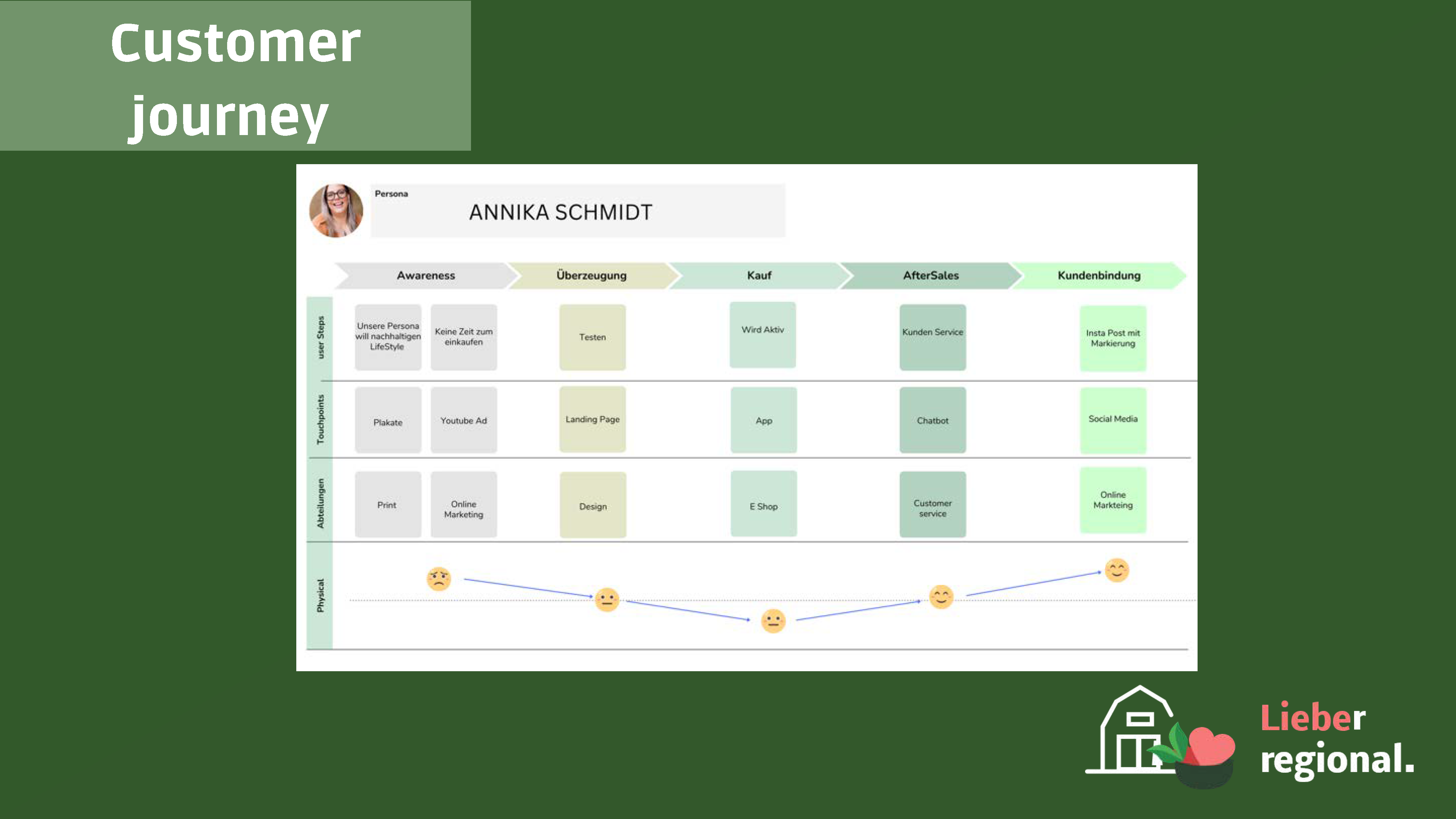
Initially, we developed a brand strategy to define our digital weekly marketplace's core values and vision, shaping its identity, positioning, and audience engagement. Then, we pinpointed campaign objectives and our target audience, constructing two personas for clarity. On this foundation, we shaped a unified campaign message and slogan for a compelling narrative.
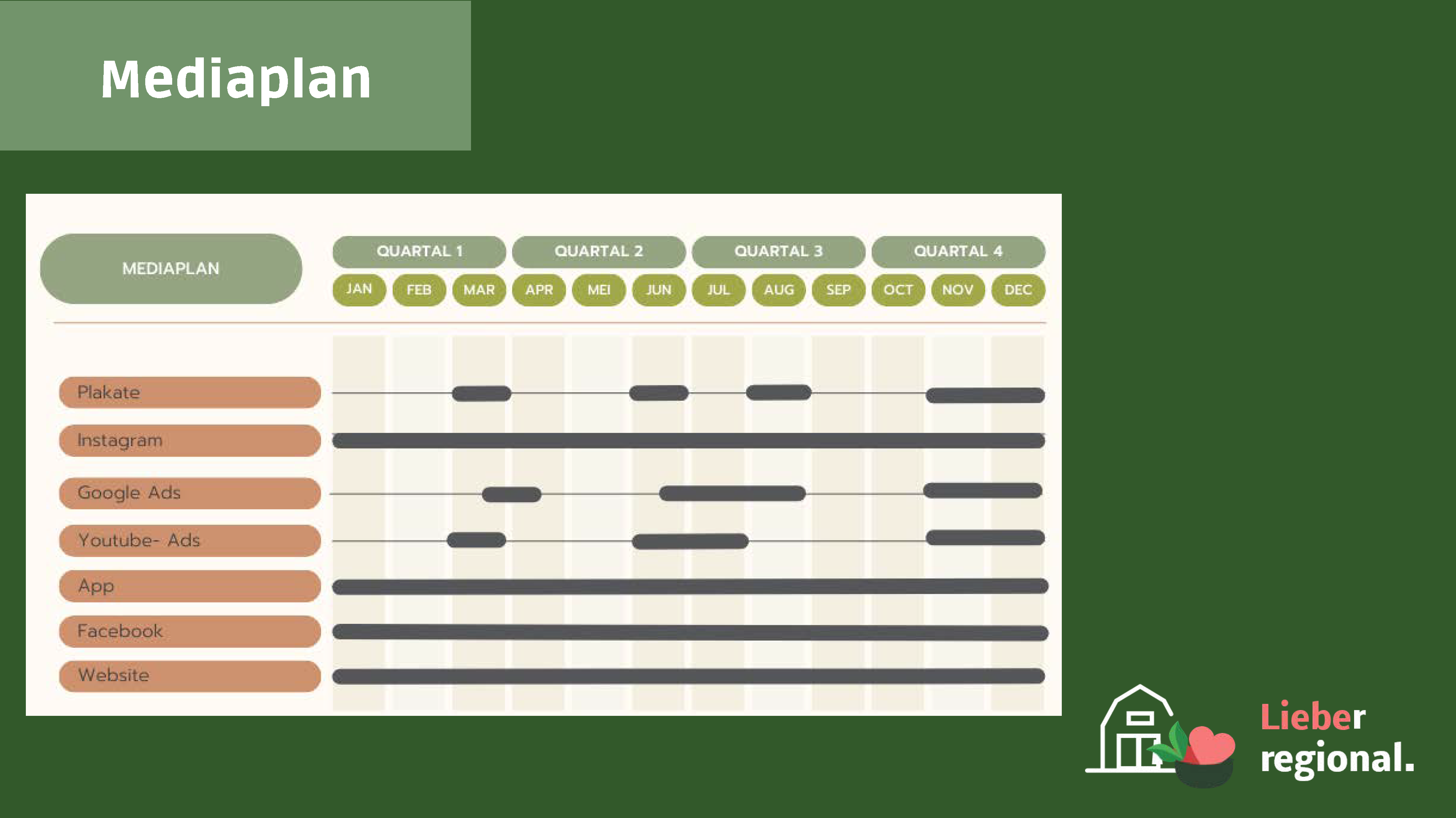
In the second phase, we carefully selected media channels for extended campaign reach. A strategic distribution and timing plan aimed for maximum engagement across platforms. For our chosen channels (offline posters, an online shop via website and app, and YouTube ads), we collectively formulated a well-defined direction for content development.
In the concluding phase, we created the content and visual elements for our chosen channels to bring the campaign to life. This included designing print media, conceptualizing YouTube ads, creating the concept and user interface for both a mobile app and a website for the digital marketplace. The integration of campaign elements ensured consistent messaging across channels.
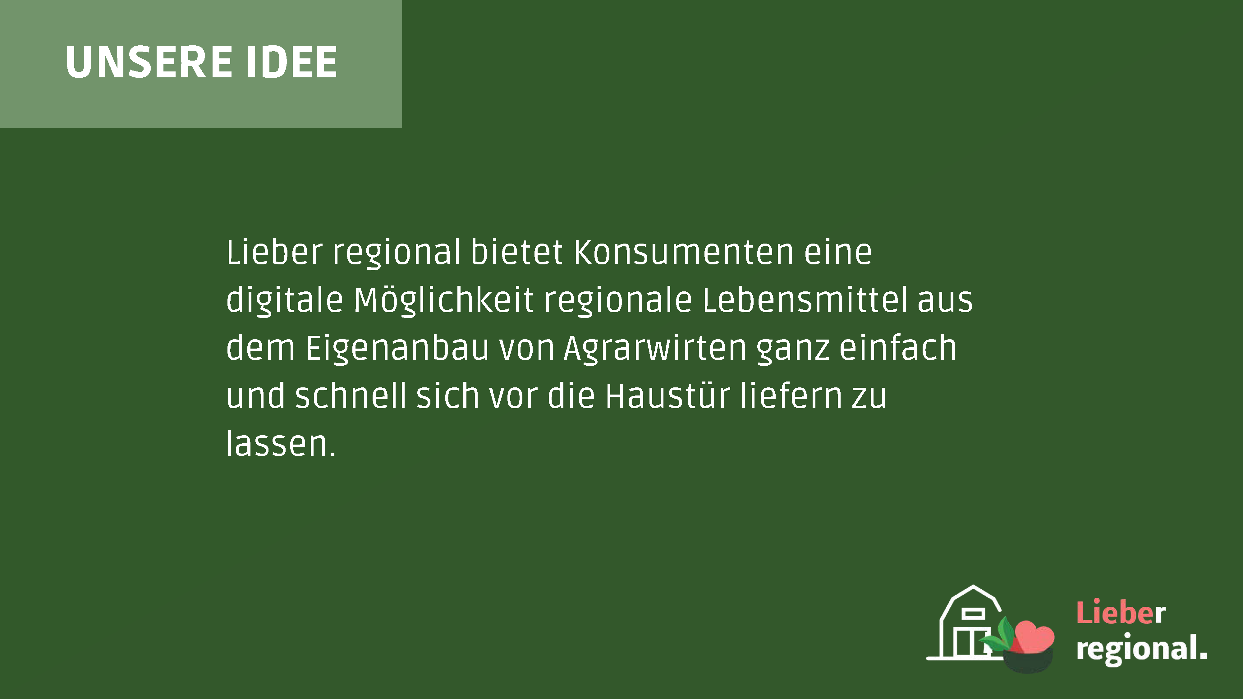
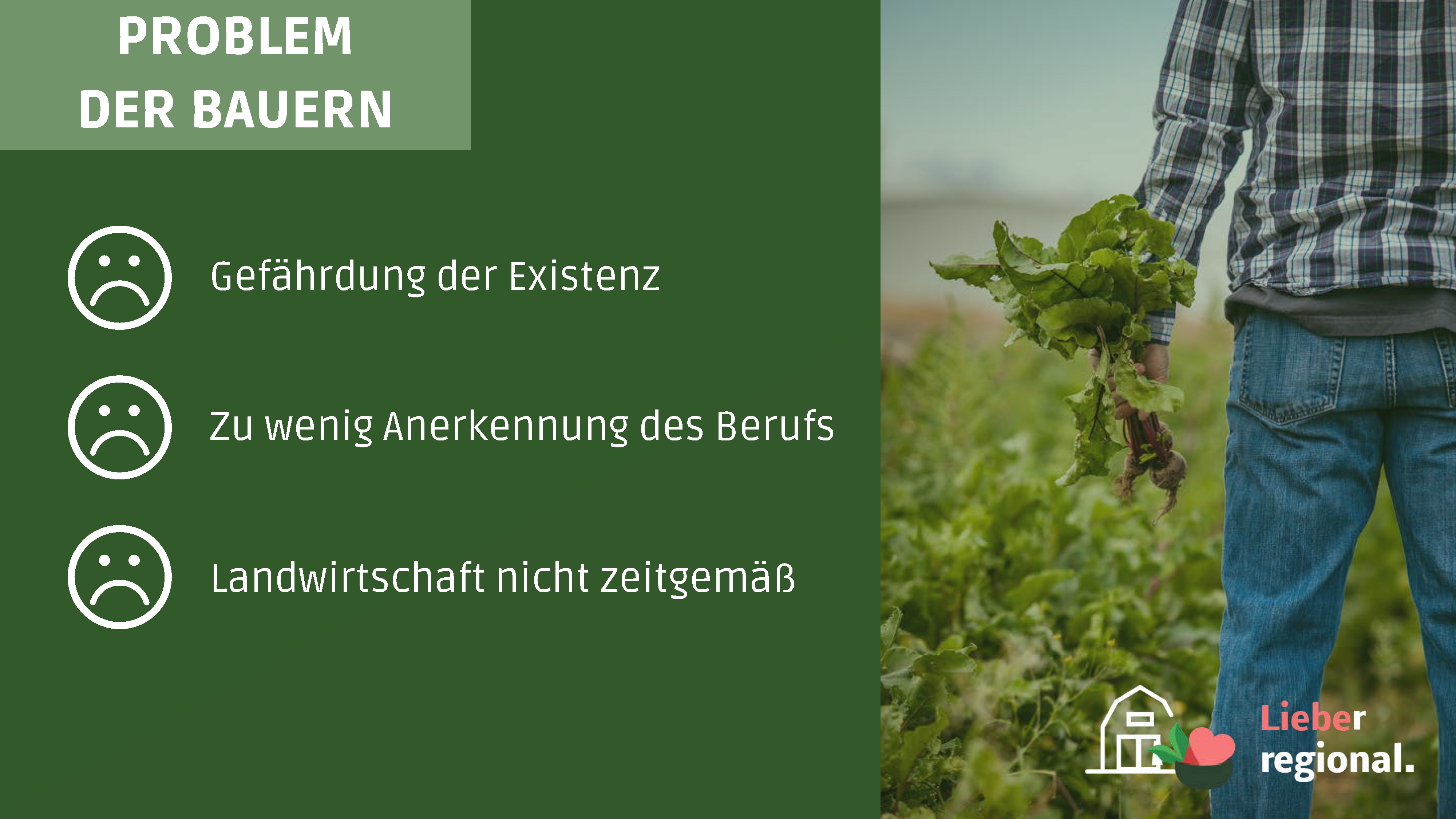
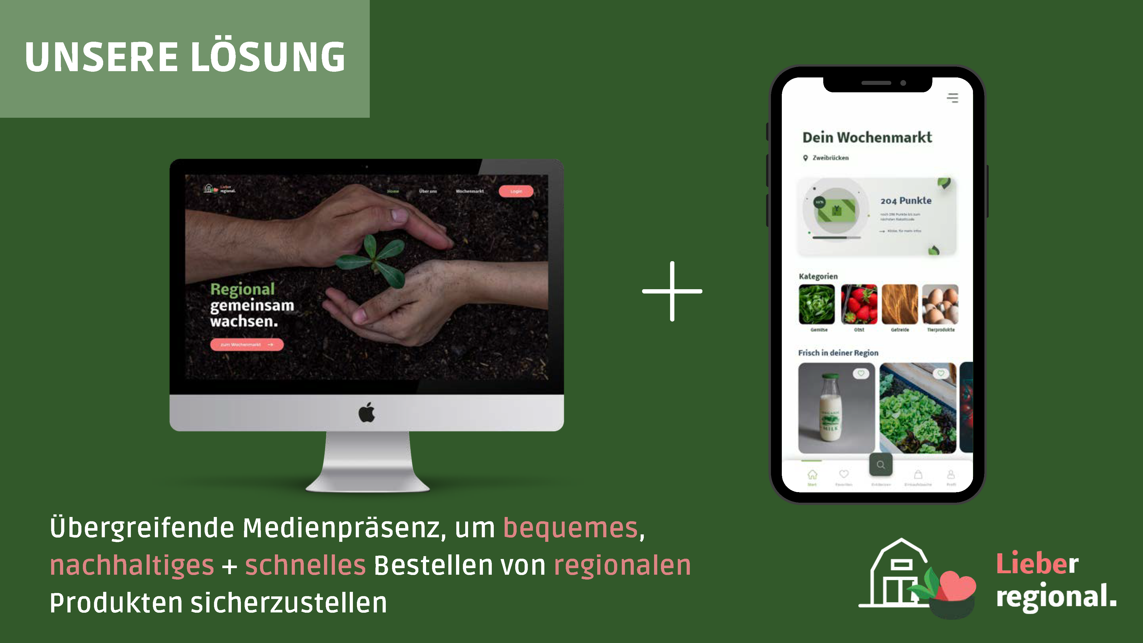
The pitch deck showcases key campaign elements: strategic planning, media planning, and a snippet of the content we developed, meaning the posters and a website/app design example. Note, this is just a fraction of our work. We've also developed a full app, website, and a YouTube Ads concept, not featured in the deck. For this reason and due to my role developing the digital media content, I'll explore content development for YouTube, offline ads, the app and website further down.
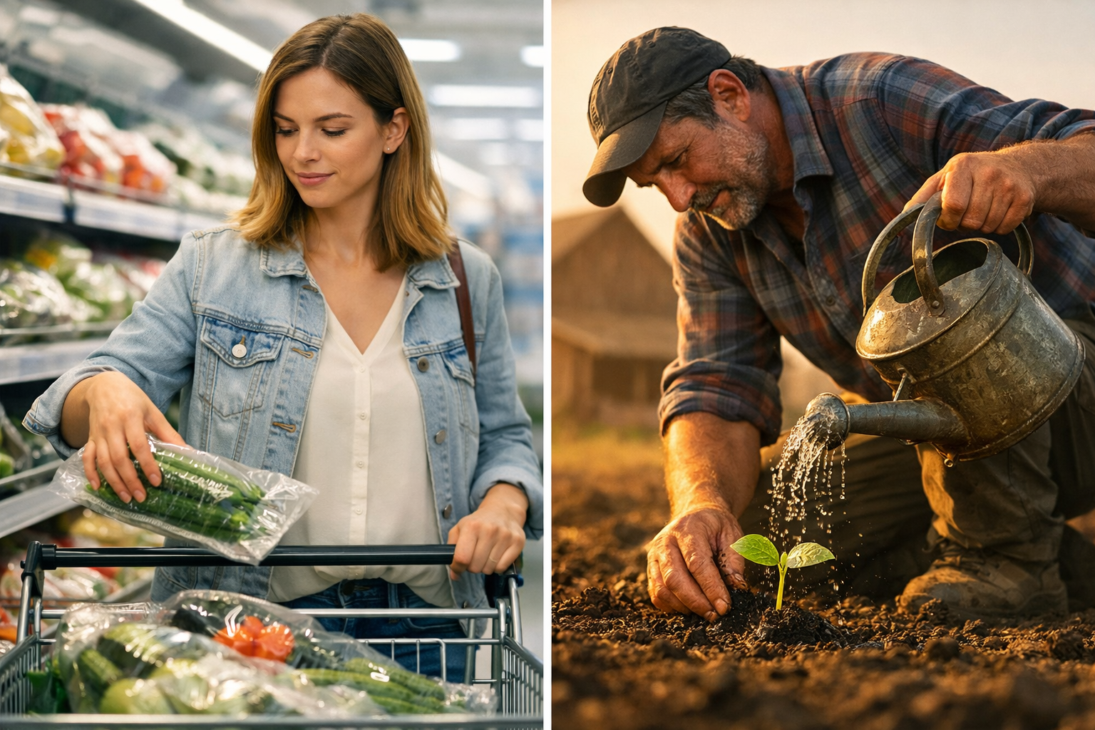
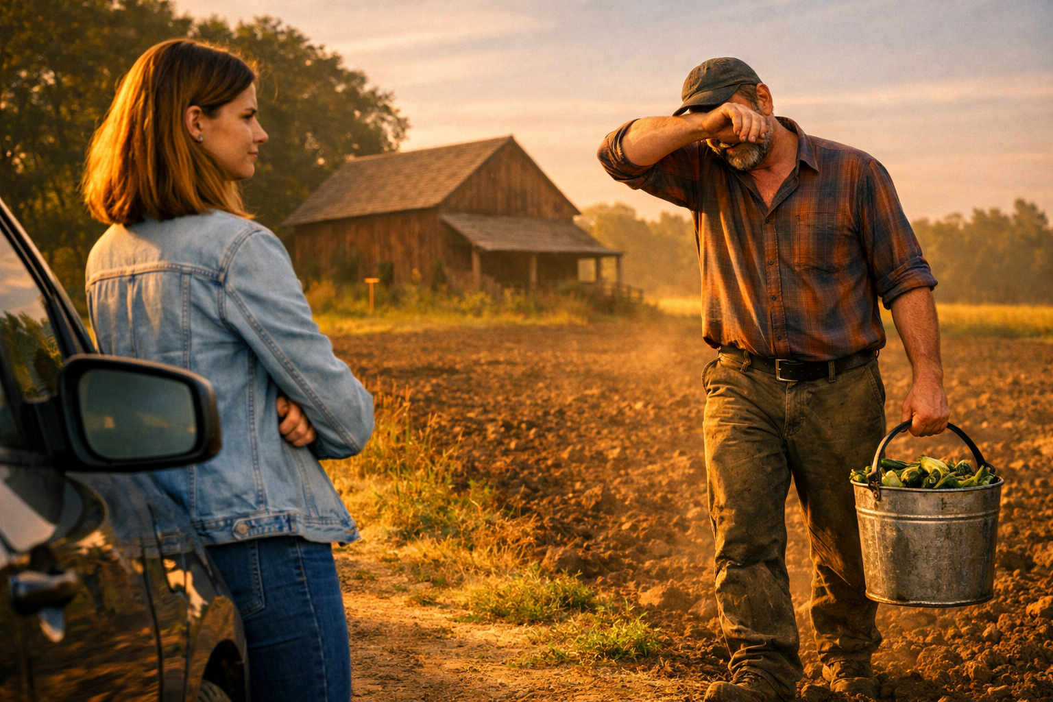
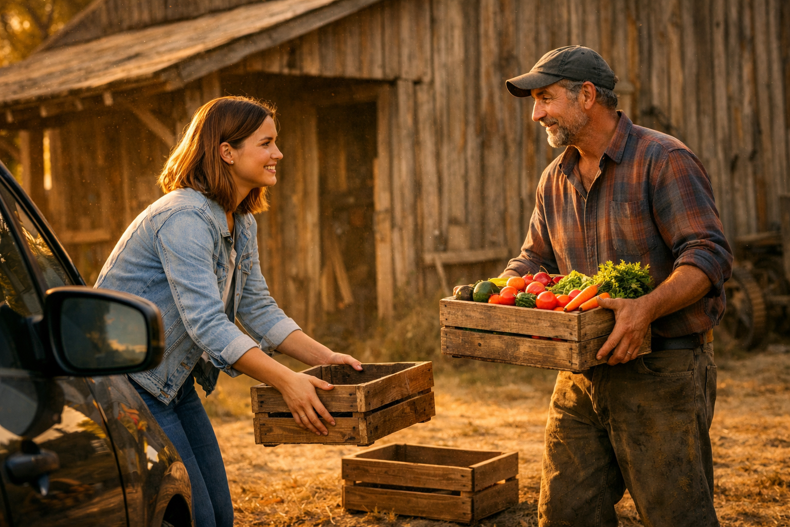
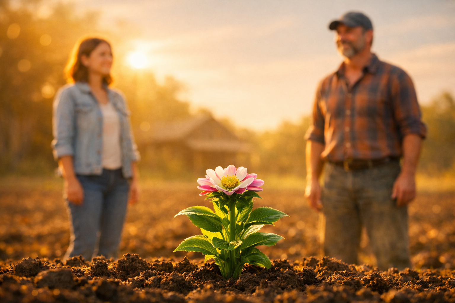
Our campaign video for YouTube Ads features three interconnected storylines that converge at the end. The storyboard is to visualize the general idea of the spot as we did not execute this in the scope of our project but wanted to convey the idea to create a comprehensive/cohesive storytelling.
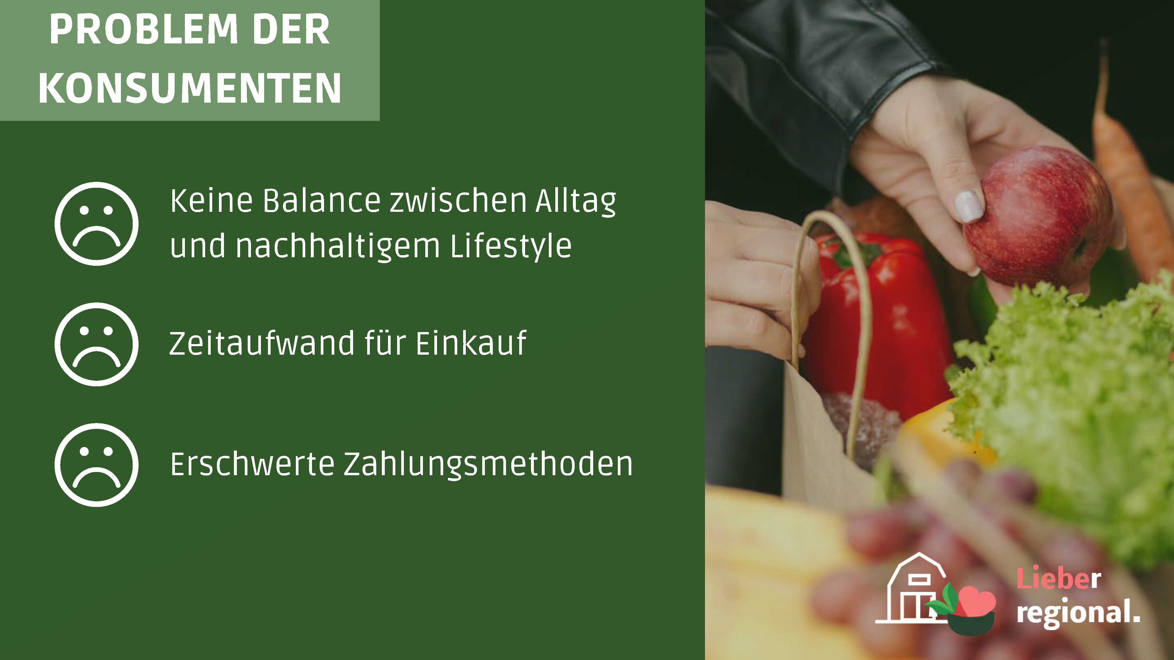
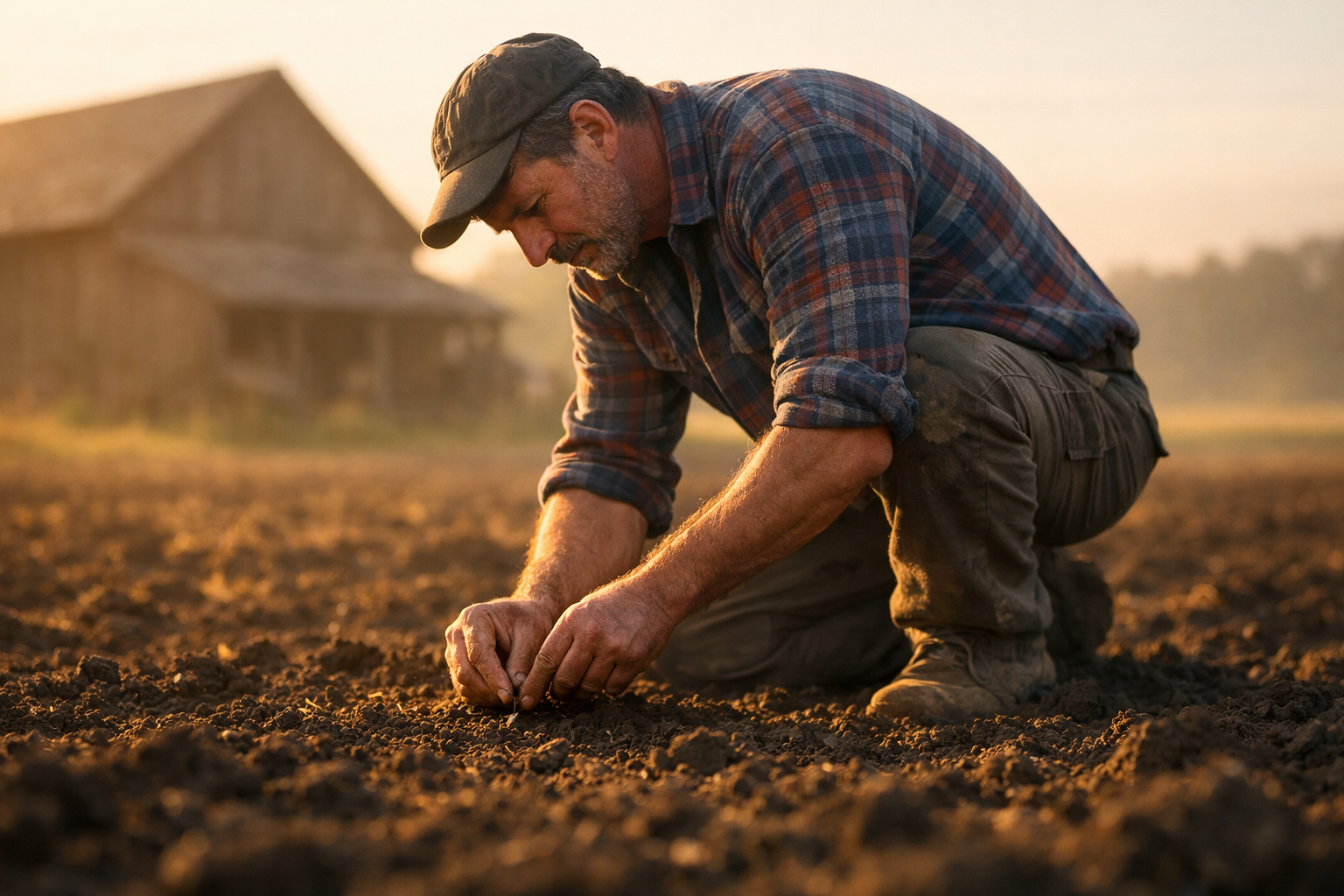
Jürgen, our protagonist, is a local small-scale farmer who leads a tightly scheduled routine on his agricultural farm. While he is passionate about his profession, it also presents significant challenges for him, as he has to sacrifice most of his free time. Constantly under the pressure of securing his livelihood, he struggles to unwind and establish a balanced work-life equation. On the other hand, our second protagonist Sarah leads a typical consumenten lifestyle of the typical consumer, not really worrying about her.
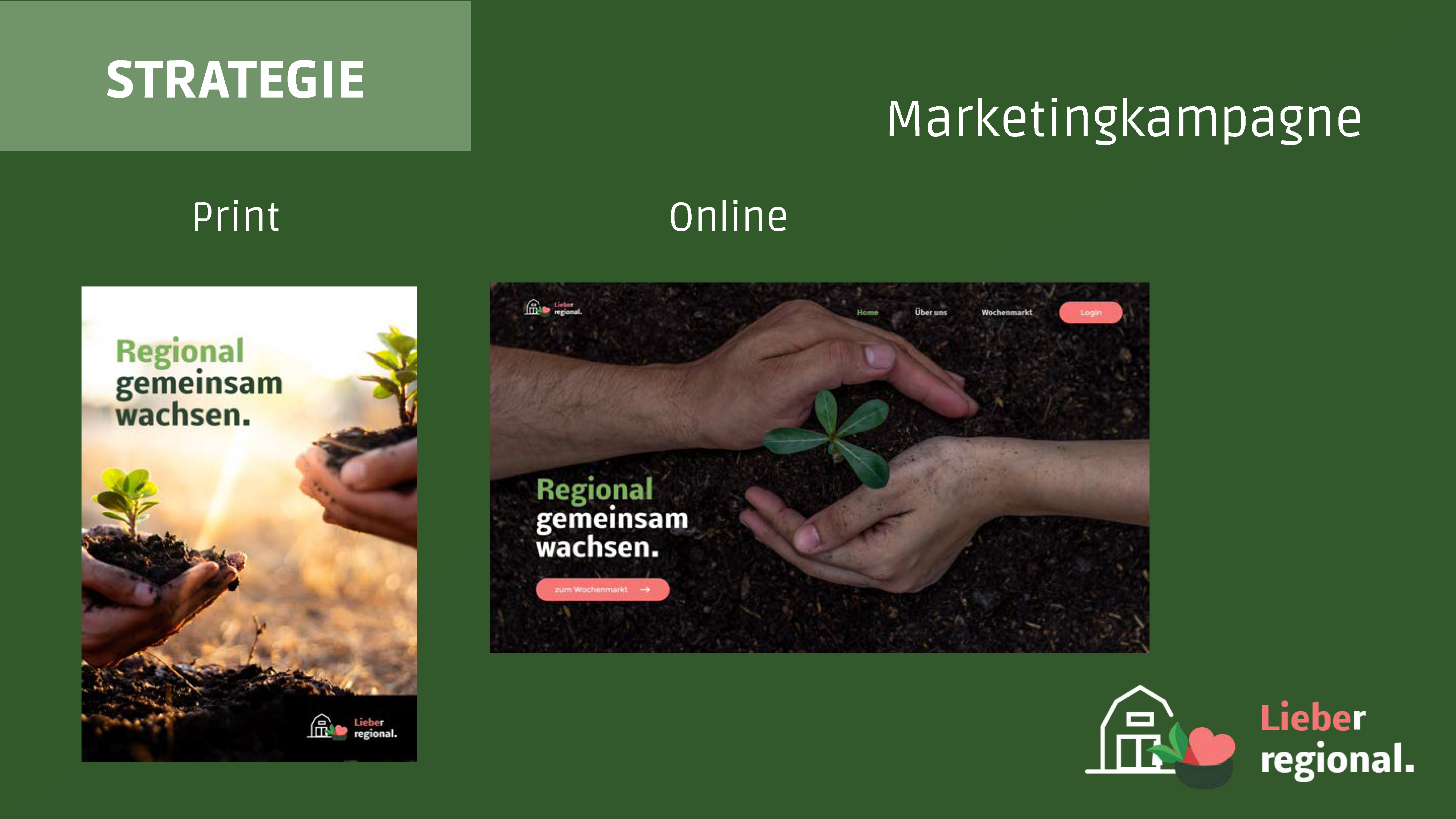
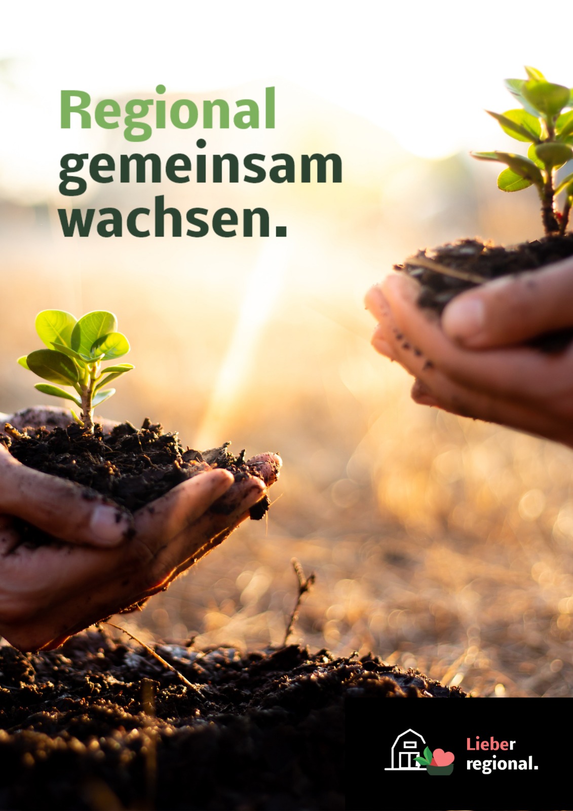
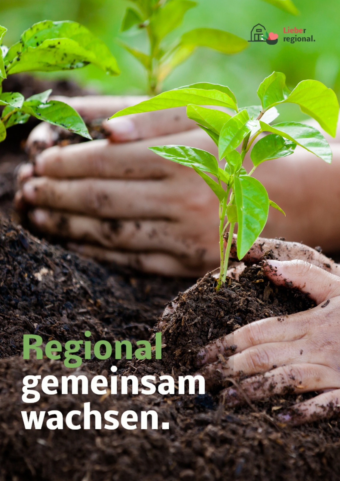
Our poster design aimed to convey the theme of regional growth and unity through the vibrant imagery of thriving saplings, complemented by our core message, "Regional gemeinsam wachsen" (Growing together regionally). We took an approach of simplicity in design, making the message more accessible, memorable, and effective - particularily crucial for outdoor posters, that are displayed in environments where attention is fleeting and visual competition is intense.
Our simple yet captivating poster design, that is created to appeal to the emotions of the target audience, aligns with these principles, reducing cognitive load and capturing attention effectively. Through this approach, we maximized the impact of outdoor advertising. Additionally, we maintained brand identity by incorporating the logo. This process seamlessly extended our campaign's coherent storytelling, resonating powerfully with our target audience.


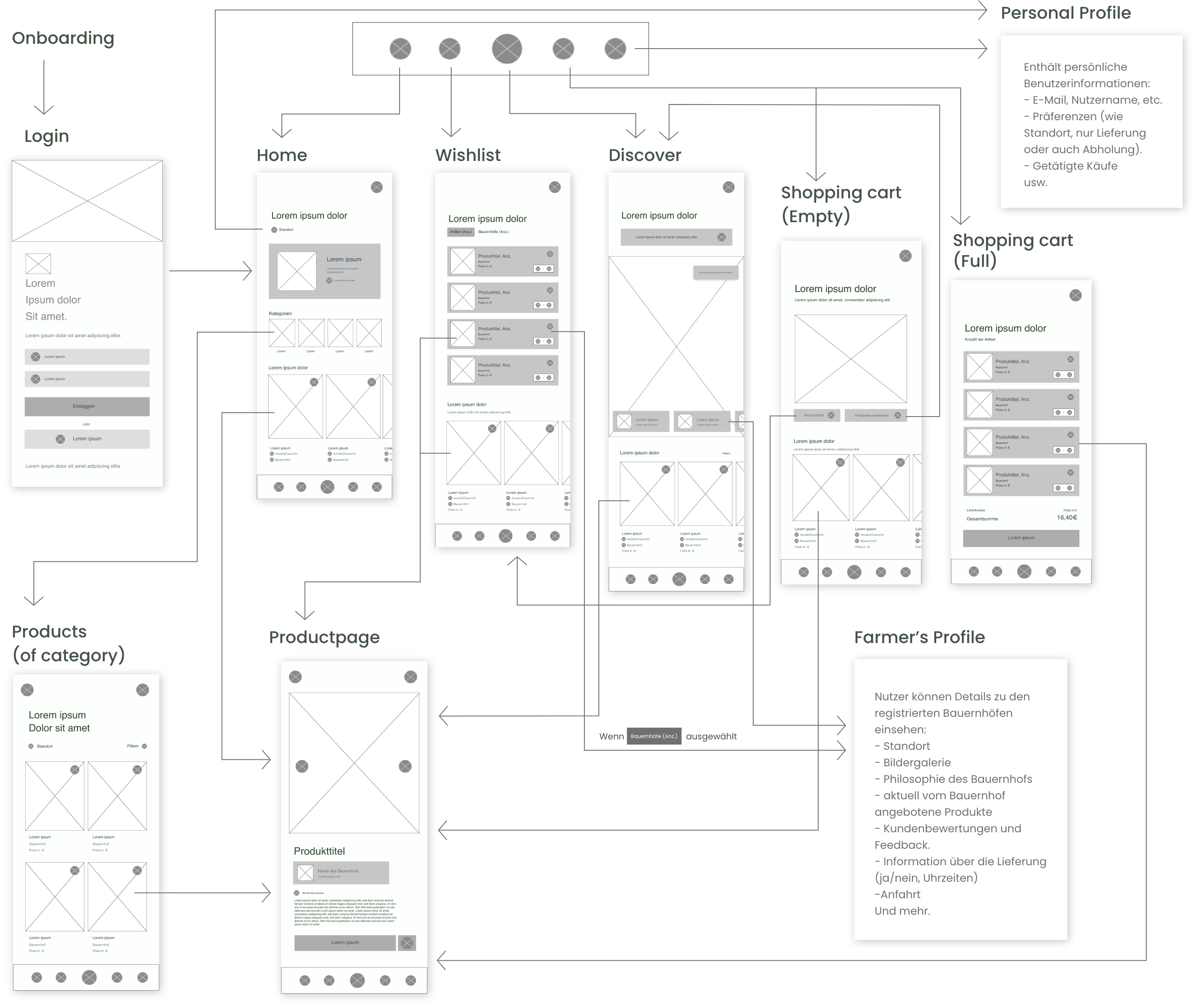
Our main project focus was on an extensive cross-media marketing campaign rather than fully developing our website and app. Thus, we collaboratively decided to only create detailed visualizations for the most important screens of the app in our wireframes, to streamline our work. For the remaining screens, we provided concise descriptions to convey the overall concept.
Given the greater complexity of our app concept compared to that of our website, where we simplified the marketplace by consolidating functions onto a single page, we chose to present the app's information architecture exclusively in this context.
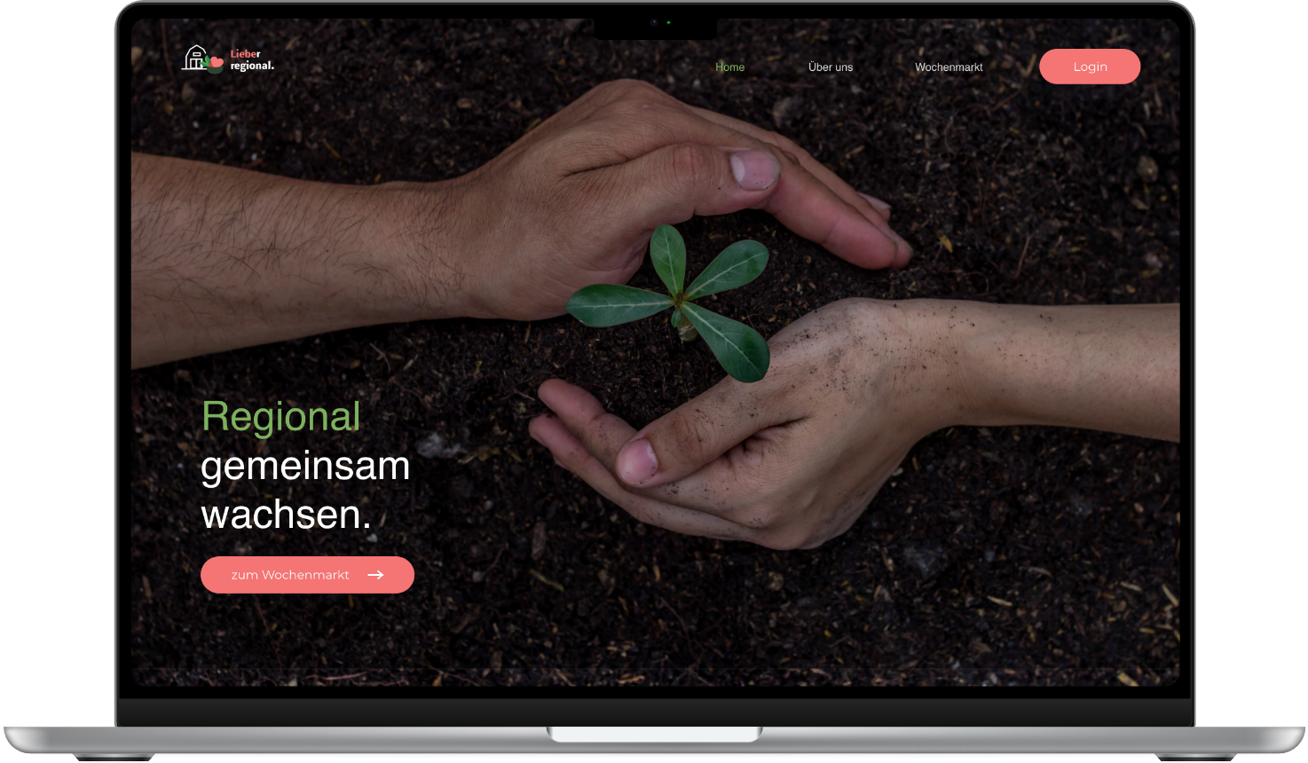
The campaign-specific landing page features a full-screen, looping short film in which the camera remains consistently focused on a field, capturing the process of hands planting a seedling. The film is an integral part of the campaign's storytelling, with its central theme of growth. Alongside the video, only only the campaign slogan and the call-to-action for the weekly market are presented on the landing page, to strategically direct attention towards the message and the call-to-action.
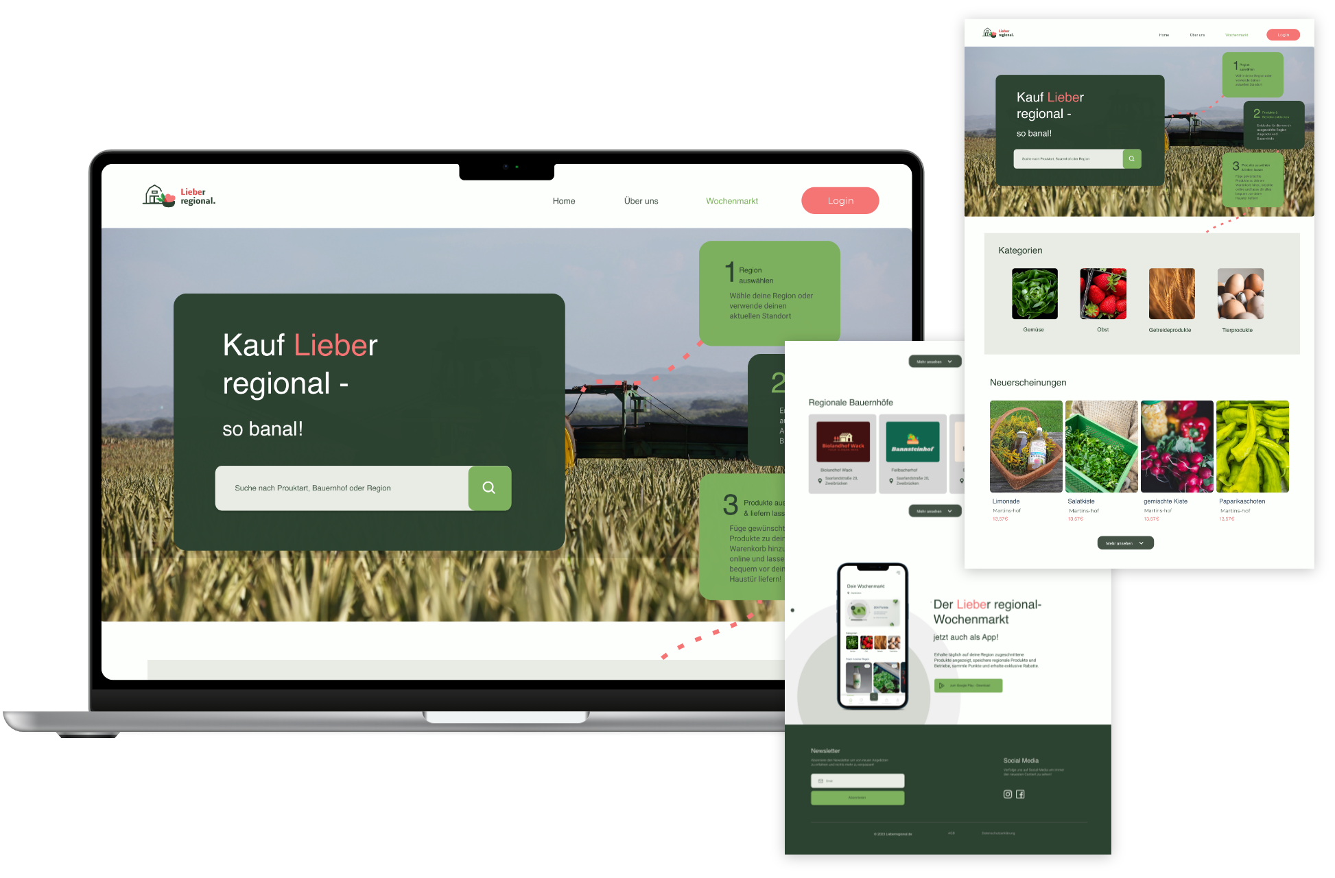
Within the header, users are introduced to the concept of the weekly market. They have the choice to either start browsing right away or log in to access the weekly market with their saved preferences (cart, wishlist, and region). They are presented with categories, new arrivals, and local farms, which can be conveniently filtered based on their type and region. Additionally, a direct call-to-action highlighting the benefits of downloading the app is integrated at the bottom of the website.
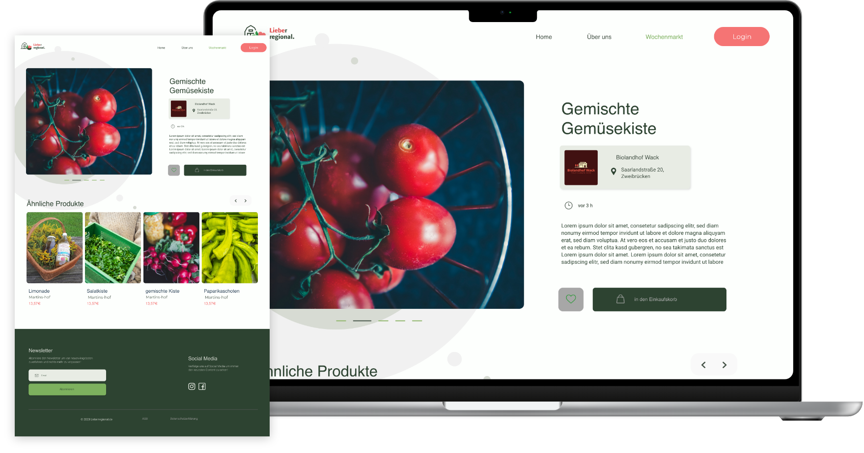
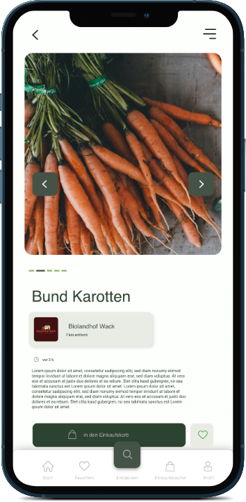
Users are provided with in-depth information about the product. This information is listed by the respective local farms through a standardized template and includes the product's name, a description, an image gallery, as well as the information which farm it originates from, along with the time of listing. The user has the option to add the product to the shopping cart or wishlist. Alternatively, he can explore the similar product suggestions.

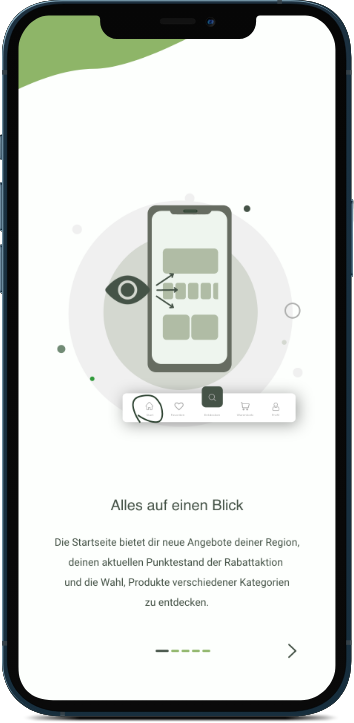
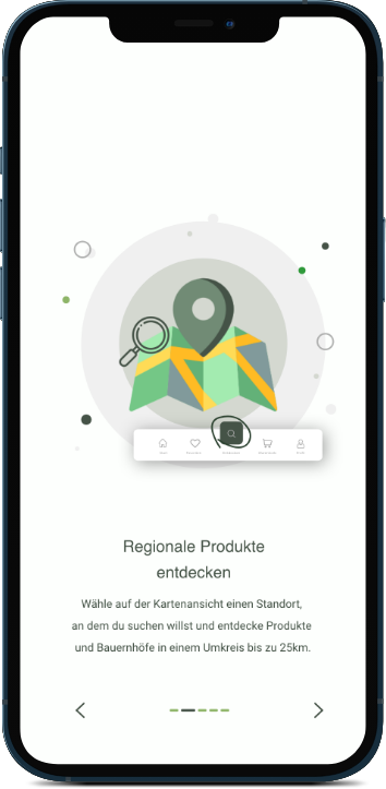
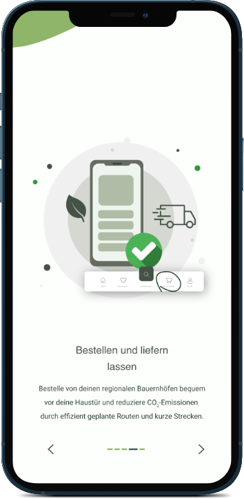
When launching the app for the first time post-download, users are guided through an onboarding experiences that introduces them to all the essential app features. This includes familiarizing them with the dashboard, exploring local products, and navigating the ordering process. For better usability and user understanding, the text is accompanied by an illustration which highlights the menu points responsible for each specific function by encircling them.
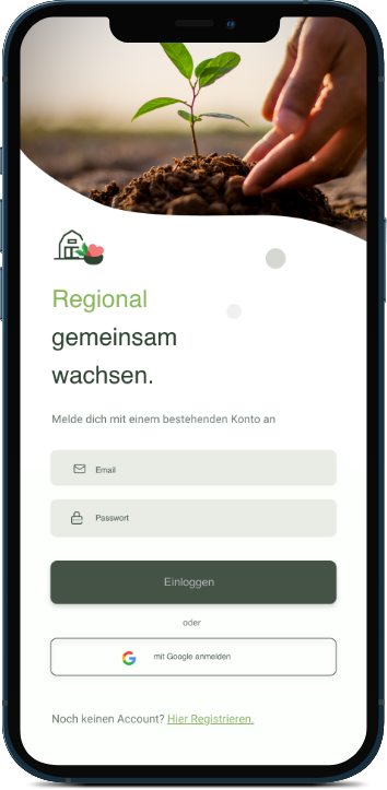
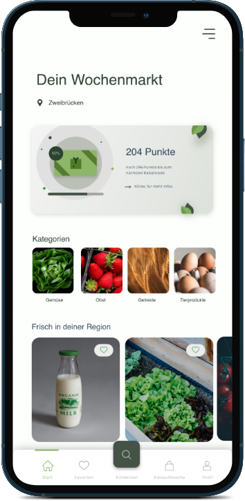
Users have the opportunity to log in or sign up if they don't have an account yet. After that, they are directed to the Homescreen, where they can view the amount of collected points. This is part of a payback system offered by "Lieber Regional", which provides a regular discount, after a set amount of money spent. Furthermore, the user is able to directly search for categories. On the Homescreen, users will also receive new offers for fresh food based on their region, which will show up at the bottom of the homescreen. If the user has not selected a region yet, they are given the opportunity to set it directly via the location icon at the start of the screen or in the settings.


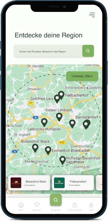
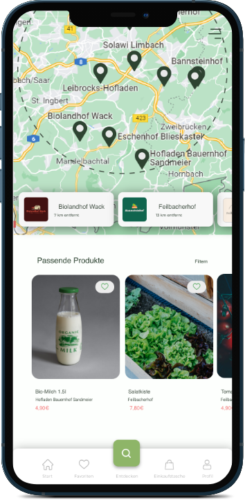
By clicking the "Search" button in the navigation menu at the bottom of the screen, the user is directed to the "Discover" screen. Here, if the user has already saved their location in the app, a default display of all farms and available products within the set region and within a specific radius, is presented. Clicking on a specific farm takes the user to that farm's profile. The radius can be adjusted in 5-kilometer increments using the button in the top right corner of the map, up to a maximum of 30 kilometers. If no region is set, the user will be shown popular farms and products.
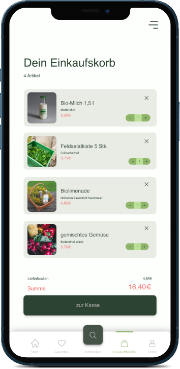
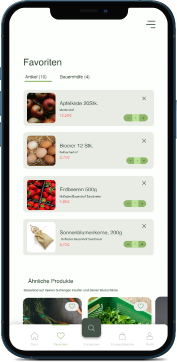
The wishlist and shopping cart share a similar structure, displaying products that are listed vertically with their titles, product images, farms, prices, and quantities. Users can toggle between viewing saved products and saved farms using tabs within the wishlist. In case of an empty shopping cart, a decorative illustration is shown, along with two call-to-action buttons leading to the wishlist and the discover page.


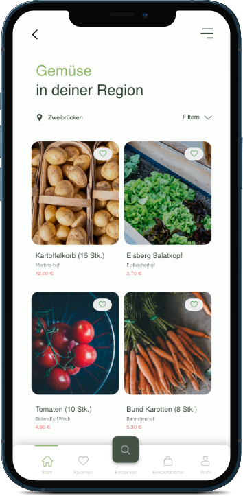
By selecting individual categories on the home screen, the user is directed to an overview page displaying all products within a specific category. These products can be filtered based on product type, price, date of listing, and whether the vegetables are sourced from organic or conventional farming. Users have the option to view products from their default region or change the region via the location icon without the need to navigate to settings. Clicking on product images, both here and throughout the app, will redirect the user to the respective product page. These product pages feature image galleries, product details, and buttons for adding items to the shopping cart or wishlist.
For “Lieber Regional,” we designed a cross-media campaign and digital concept to support local agriculture. The project highlighted the crucial link between creative concepts and operational feasibility.
Financially, early budget constraints would have sharpened our print production, such as consolidating poster variants to cut costs. Logistically, shifting from a centralized delivery model to individual farm fulfillment revealed critical challenges regarding delivery consistency and environmental overhead.
Ultimately, my main takeaway was that real-world impact relies entirely on operational feasibility—requiring us to design not just the user experience, but the logistical infrastructure behind it.
The “Lieber Regional” concept remains realistically attainable, but a market-ready version hinges on detailed financial and budget planning, above all a viable delivery and cost model. We are proud of the tailored, creative campaign content and are confident it would resonate strongly with the target audience given a well-planned launch.