SoundCloud Redesign.
Improving the percieved Usability of a Hybrid Music Platform.
SoundCloud uniquely combines music streaming with social platform mechanics in a single app, resulting in a feature-dense experience that places high demands on navigation, consistency, and interaction efficiency. Despite this complexity, its mobile usability has received little systematic attention. To explore how its usability could be improved, I conducted a full heuristic evaluation of the app, designed a complete comprehensive redesign, and measured the effect on perceived usability empirically, comparing the redesign against the original using the System Usability Scale (SUS).
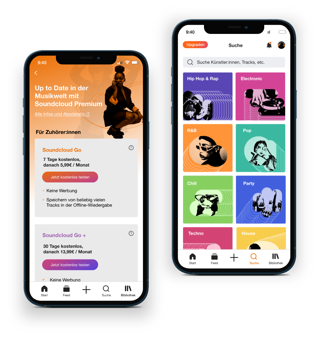
Project Overview
Guided by Human-Centered Design principles, my approach follows three consecutive phases. The objective was to systematically diagnose the SoundCloud app's usability, design a redesign based on these findings, and validate its actual impact on the perceived user experience.
01
Research
The project started with a comprehensive heuristic evaluation of the original SoundCloud app to identify usability issues across navigation, interaction, consistency, and information architecture. The findings established a clear foundation for the redesign process.
02
Redesign
Based on the identified usability problems and derived design requirements the application’s structure and interface were redesigned. The process included restructuring of the information architecture and redesigning of each screen to create a high-fidelity prototype.
03
Evaluation
To assess the effectiveness of the redesign, users completed representative tasks in both the original and redesigned interfaces. Perceived usability was measured using the System Usability Scale (SUS), allowing a direct comparison between both versions and validating the impact of the design improvements.
UX-Research
The Heuristic Evaluation
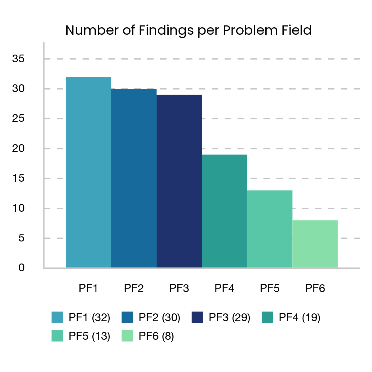
The foundation of this evaluation was the comprehensive understanding of the app, mapping all screens, features, and navigational paths into a structural and functional model. Based on this, I defined 24 distinct entities (self-contained units of analysis) to systematically screen for usability flaws. The assessment utilized Nielsen’s classic 10 heuristics, augmented by mobile-specific extensions from Inostroza’s SMASH framework. This process yielded a total of 131 usability findings.
Problem Fields as key findings
Many of the 131 findings shared underlying themes and reoccurred across multiple screens. Using affinity diagramming, I consolidated them into six core problem areas (PF1 to PF6). The three most frequent categories alone account for roughly 70% of all issues, indicating deep-rooted structural flaws within the app.
Consequently, the redesign could not focus solely on isolated findings at a detail level. Instead of only fixing local details, I had to look at the bigger picture and address the structural flaws as a cohesive whole.

Internal & External Inconsistencies (PF 1)
Comparable interface elements (such as headers, icons, and secondary navigation) lack visual consistency and deviate from established UI conventions. E.g. double-tapping a track leads to audio playback instead of the commonly expected “like” action.

Visual Clutter & Weak Hierarchy (PF 2)
Scanning the interface requires unnecessary cognitive effort due to limited visual hierarchy, insufficient grouping, and inadequate emphasis on key actions. As a result, important content often competes with low-priority elements.

Unclear Labels, Icons & Mappings(PF 3)
Design elements occasionally fail to communicate their function, forcing users to guess the context. For instance, misleading labels like “Tap to preview” unexpectedly trigger full playback, while misplaced categories disrupt intuitive navigation.

Poor Discoverability & Interaction Efficiency (PF 4)
Core functionalities are located in unexpected places or require unnecessarily complex interaction flows. E.g. essential actions such as Repost or Delete Track are hidden behind additional menu layers, increasing user effort and reducing efficiency.

Insufficient Feedback & Context (PF 5)
The application’s system status is communicated inconsistently, leaving users with limited feedback about ongoing processes. Currently playing tracks are not persistently visible, message counts are absent, and empty states trigger generic errors.rather than informative feedback.

Poor Mobile Usability & Touch Interaction (PF 6)
Interactive elements, such as icons and buttons, do not consistently meet recommended touch target sizes and are often positioned too closely together. This reduces accessibility, impairs one-handed use, and increases the likelihood of accidental interactions.
Deriving Design requirements
To ensure that every redesign decision remained traceable to the evaluation, I derived design requirements on two complementary levels:
- At the detailed level: local requirements, each tied directly to a specific finding and addressed at the corresponding point in the redesign.
- At the problem area level: one overarching design guideline per problem area (GA1–GA6), together forming the framework that informed every design decision throughout the process.
Das Redesign
Systematic Problemfix
Based on the design requirements and actionable implementation proposals, the app design was thoroughly redesigned. The final prototype is entirely evidence-based so every decision traces back to at least one documented finding. To maintain brand consistency, the app's visual identity was deliberately preserved—meaning the overhaul transformed the user experience, not the overall aesthetic look.
Predictable: Consistent & Established Patterns
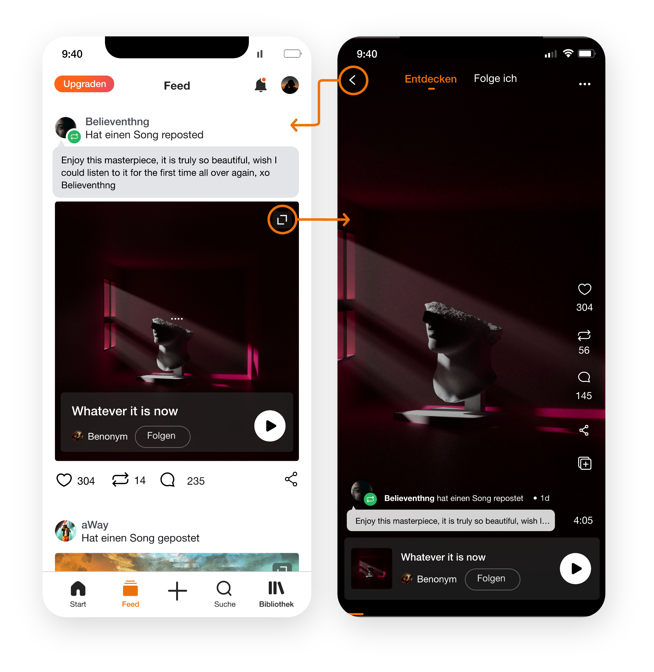
All comparable views were redesigned to share a unified layout and structure. For instance, all main views now utilize an identical header configuration, ensuring notifications and profile access are permanently anchored in the top navigation. Buttons and icons follow a rigorous, consistent visual system. Furthermore, the interface aligns with industry-standard mobile conventions, leveraging users’ existing mental models from other applications. A prime example is bridging the classic feed view with a full-screen mode via a zoom function, closely modeled after the familiar interaction pattern of Instagram.
Scannable: Essentials at a glance
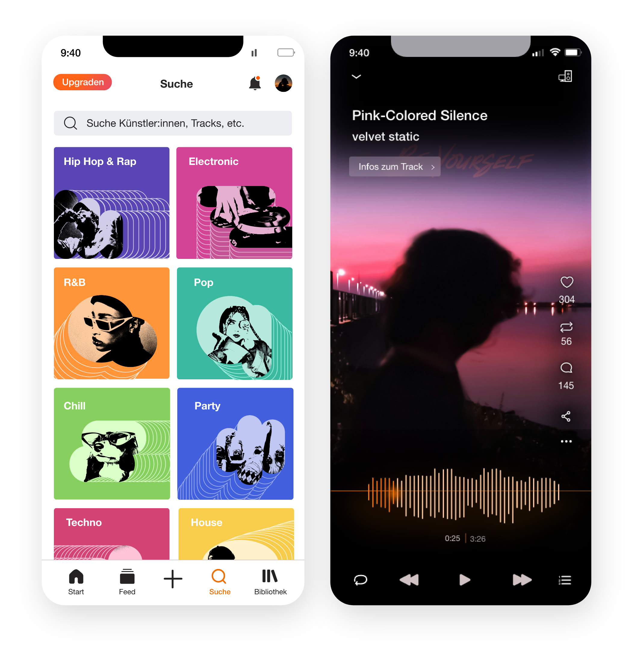
To accelerate content consumption, the redesign prioritizes generous white space, clear grouping, and a strict visual hierarchy. Secondary information was intentionally deemphasized, and clutter was removed to minimize cognitive load. In the search view, optimized contrasts and standardized dimensions now allow for instant visual separation of genre cards. Similarly, the music player and feed were stripped down to their core essentials: the album artwork is the center and focal point, framed by track metadata, playback controls, and the main action bar.
Intuitive: Clear & intelligible Elements
By refining copy, iconography, and placement, ambiguities across the entire interface were systematically eliminated. Every UI element now instantly communicates its function and context. A key improvement is the restructured information architecture of the library. Ambiguous folders like “Following” and “Insights” which didn't match mental models of a media library were removed. Additionally, misleading headings, error messages, and empty states underwent a thorough UX-writing overhaul, ensuring the purpose of every view is immediately self-explanatory.
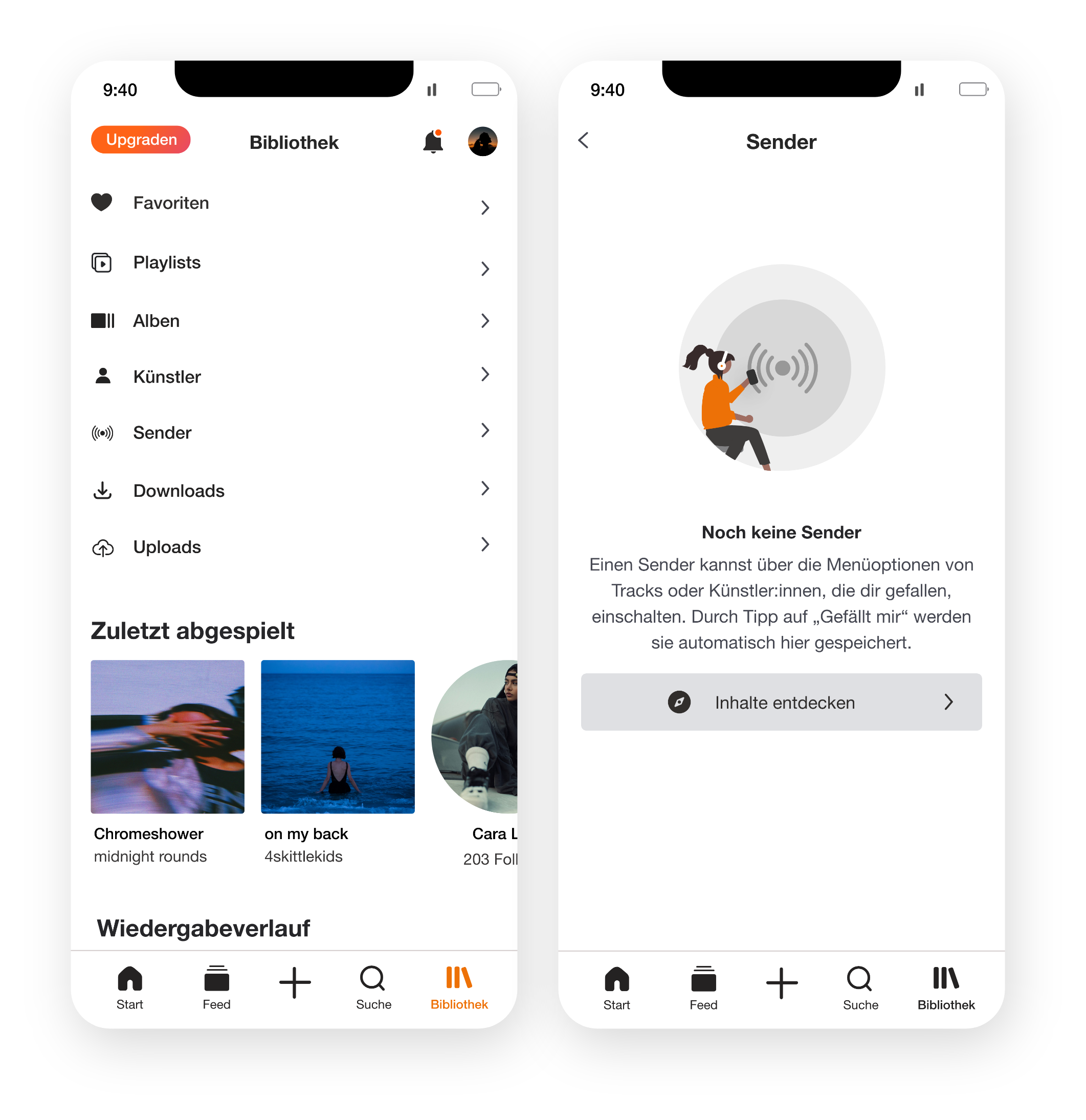
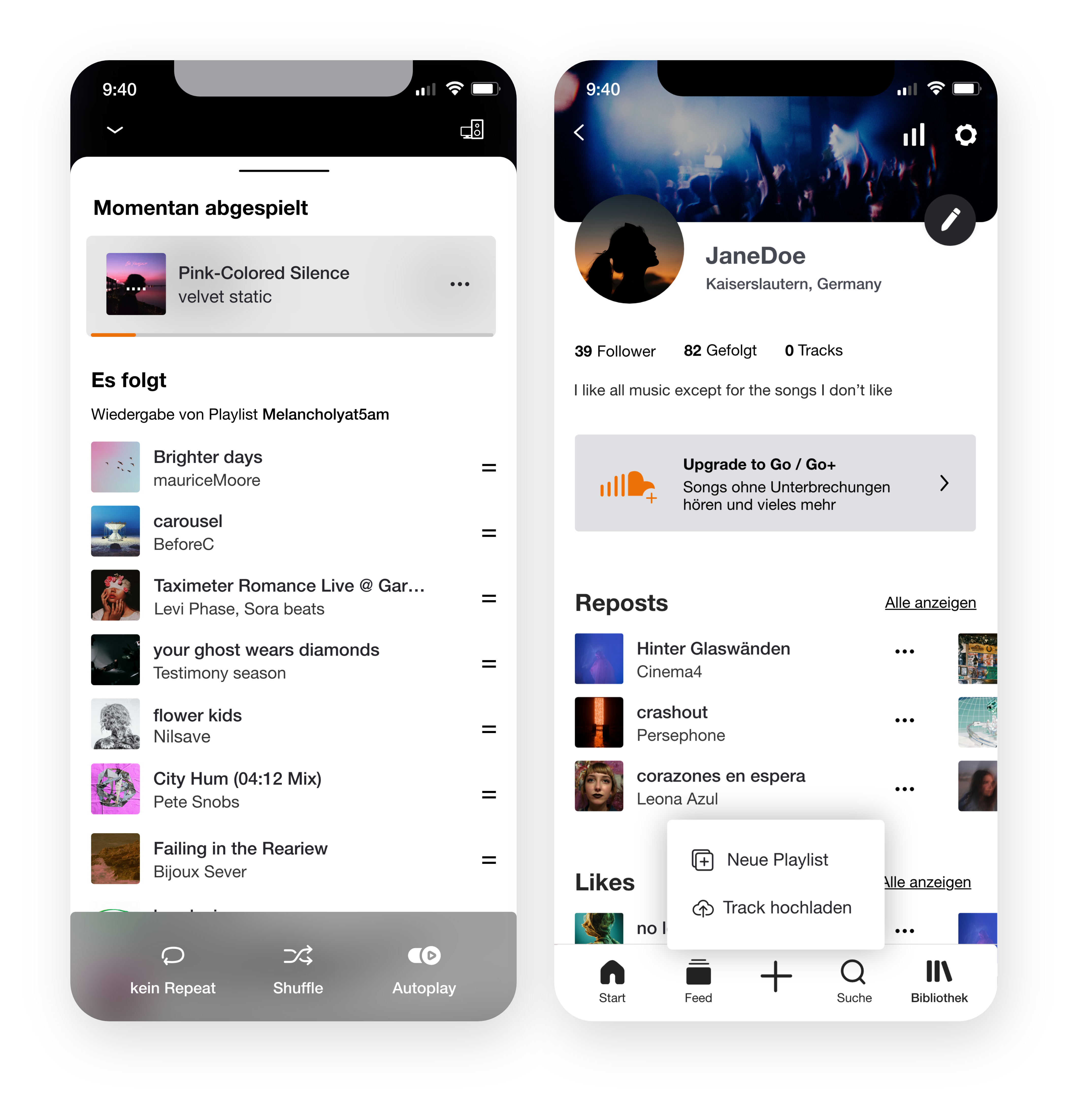
Efficient: Frictionless Access to Core Actions
To boost user efficiency, unnecessary intermediate steps were removed, shortcuts introduced, and critical functions placed at predictable locations. This significantly minimizes interaction time throughout the app. The repost function is now prominently surfaced directly within the music player. Additionally, a new, omnipresent plus button in the primary navigation provides a dedicated anchor for creation and onboarding actions. Task optimization also reached the queue management, where tracks can now be removed in a single step with minimal tap effort.
Transparent: Clear Context & System Status
The redesign ensures that the active state of the app is always accurately communicated, removing any operational friction. A prime example is the new, recurring playback card component. This card bundles track information and essential controls into a compact component that is used consistently across views, such as the comments section or the queue where context was previously lost. Additionally, the app now clearly indicates the number of incoming messages and Empty-state behaviors are corrected. As a result, users never have to guess the app's current status again.
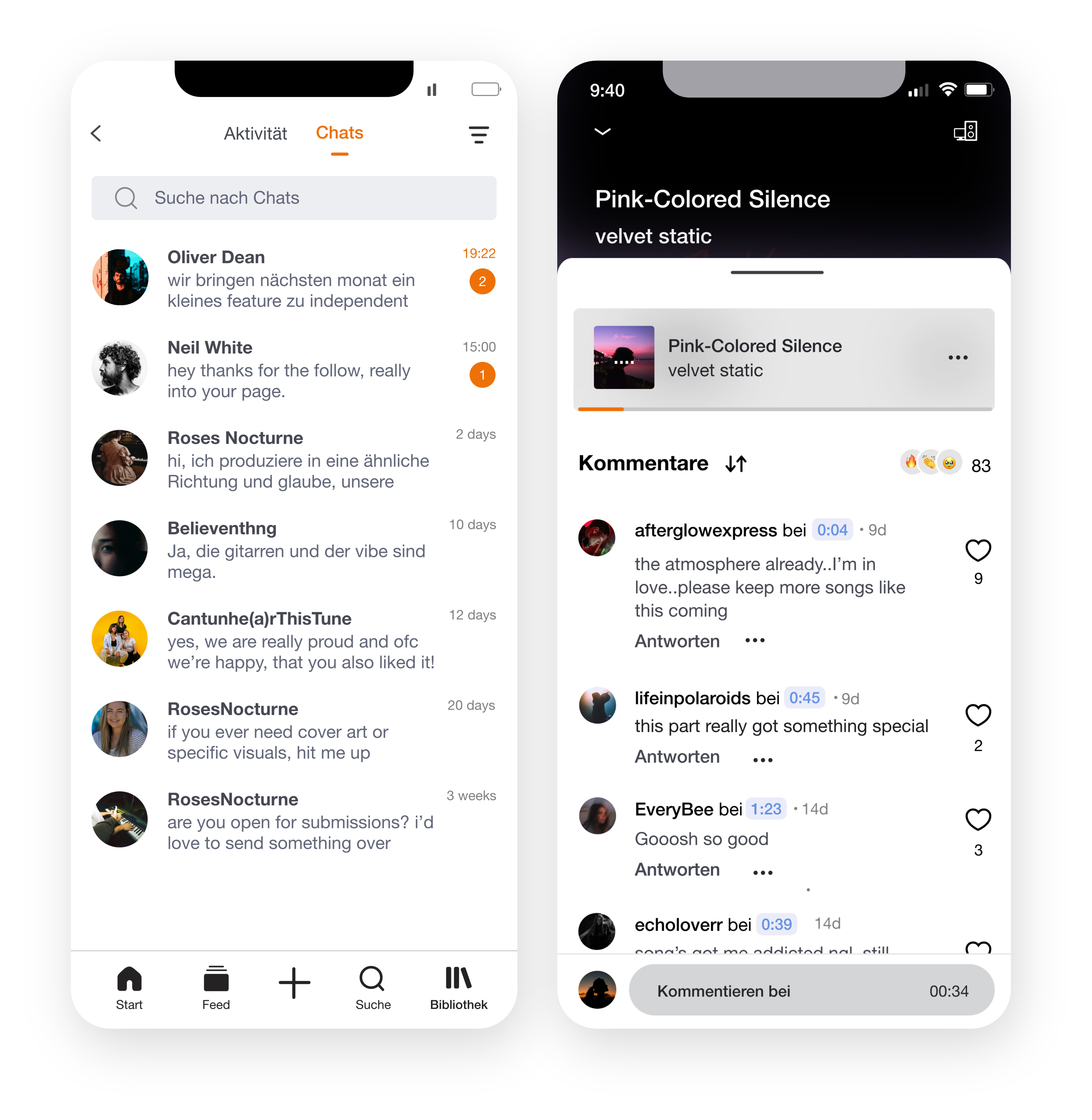
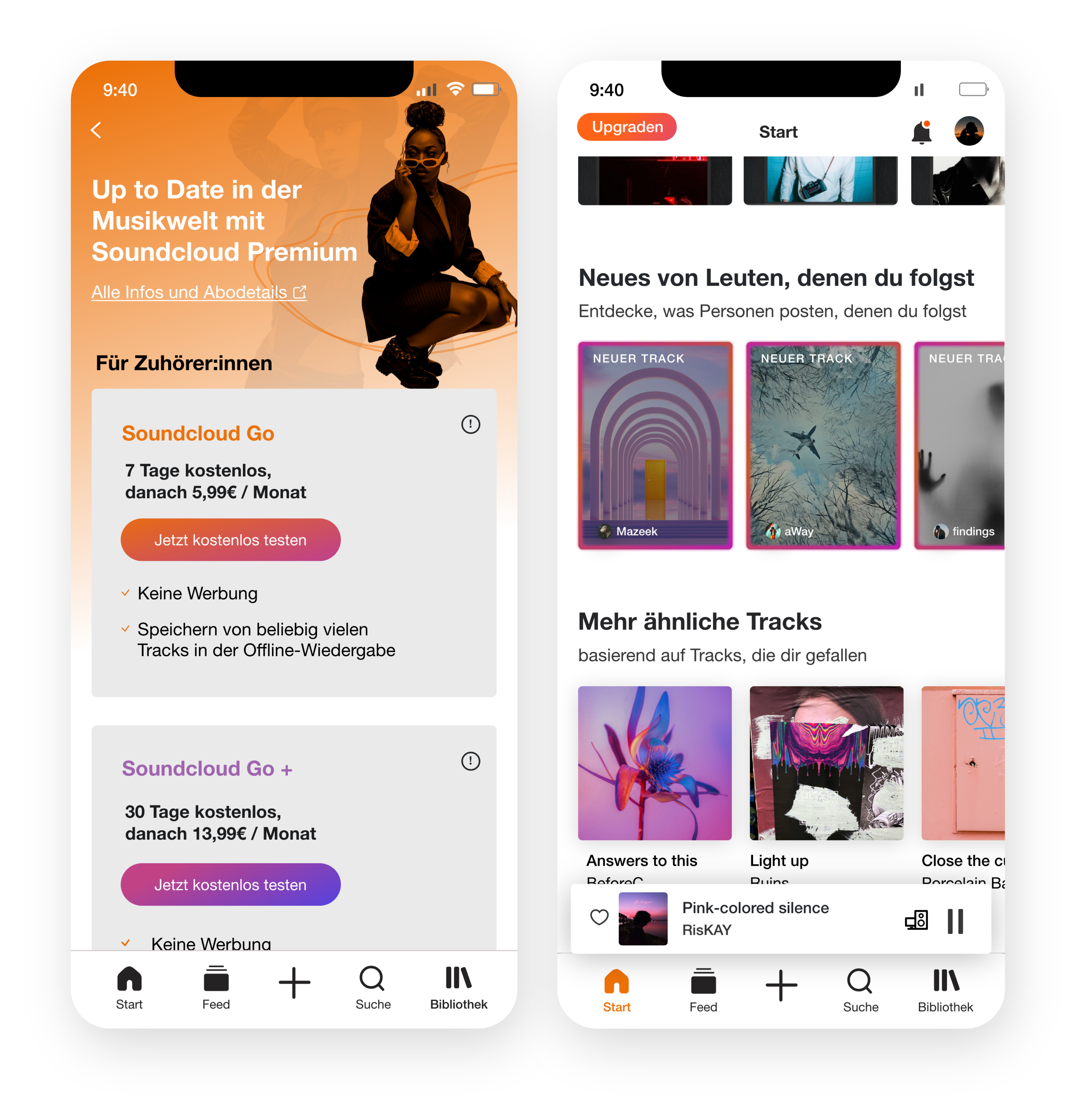
Ergonomic: Optimized One-Handed Usability
Suboptimal touch targets and cramped spacing negatively impacted the mobile experience before. The redesign corrects these flaws by restructuring interactive elements according to physical ergonomic standards. Buttons and icons now offer bigger target areas and optimized spacing to eliminate accidental mistaps. To support effortless one-handed use, key playback controls were shifted into the natural thumb zone at the bottom of the screen. Furthermore, a stable vertical scrolling layout replaces the error-prone horizontal swipe in the upgrade view, preventing accidental purchase triggers.
SUS-Evaluation
User Research: Original App vs. Redesign
To verify whether the changes are actually perceived as improvements from the user's perspective, 13 participants rated both versions of the application using the System Usability Scale (SUS). Utilizing a within-subject design, each participant evaluated both systems in a randomized and counterbalanced order to eliminate sequence effects.
Is there a measurable improvement?
(original → redesign)
in SUS points
the redesign higher
The original app reached a mean score of M = 49.0 (median 47.5), placing its percieved usability in the low-to-critical range according to Bangor et al.’s adjective scale. Conversely, the redesign prototype scored M = 84.6 (median 87.5), landing in the good-to-excellent range. More telling than the mean alone is that all 13 participants rated the prototype higher individually. The reduced variance and a consistent cross-order comparison (+35.0 vs. +36.3 points) further rule out significant outlier or sequence effects.
Given the small convenience sample, this analysis remains strictly descriptive. While it does not claim generalizable statistical proof, it demonstrates a highly compelling, methodologically plausible trend within this study's context.
Conclusion
Reflection:
While the value of this project shows through the final, positive System Usability Scale (SUS) results, its true strength lies in the systematic methodology and the clear chain of reasoning behind every design change. Each decision is directly traceable to a documented finding — from the heuristic evaluation and derived design requirements to the final prototype.
The outcome is highly robust because the heuristic analysis, SUS scores, and qualitative feedback all consistently pointed to the same opportunities for optimization. The redesign successfully delivers a measurably higher level of perceived usability, establishing a strong foundation for future development.
Key Takeaways:
My biggest learning was how to make design decisions consistently defensible while clearly acknowledging limitations. I learned to deliberately navigate the tension between user needs and platform business goals and developed the ability to frame research results honestly and objectively, avoiding over-interpretation.
Outlook & Next Steps:
A logical next step would be a collaborative heuristic evaluation involving multiple independent UX design experts to minimize evaluator bias and surface any remaining deficits. In more advanced phases, the prototype should be validated further the prototype should be validated further, e.g. through usability testing on a functional MVP, A/B testing of individual features, and SUS surveys with larger, more representative samples.